Environmental Effects on Covid-19
Brandyn Ruiz
11/13/2020
Website Home
Introduction
With the recent events of covid cases on the rise and steadly holding just barely and with the rise of fires all over California with the sky being orange miles away from the fire for days, this year has definitely been so unusual and unprecedented times. The Corona virus has been found to inhibit respiratory functions of the host and with the recent fires the air quality within many cities of the 58 counties has sky rocketed to concerning levels. Depending on someone’s geographical location and which county they live in, their health could already be at risk due to the air quality alone. Would this make a subject more vulnerable to contracting covid if their respiratory function was already inhibited? My hypothesis that I want to further explore is whether there is an association between air quality and confirmed cases of covid amongst people within the counties of California.
Covid Cases within the States
download.file("https://raw.githubusercontent.com/CSSEGISandData/COVID-19/master/csse_covid_19_data/csse_covid_19_time_series/time_series_covid19_confirmed_US.csv", "time_series_covid19_confirmed_US.csv", method="libcurl", timeout = 60)

covidGithub <- data.table::fread("time_series_covid19_confirmed_US.csv")
Incidence Cases Across the Pandemic
# Time series visual of incidence cases from the start of the pandemic
p1<-ggplot(covidGithubmelt, aes(Date, new_cases, color = county))+
  geom_line()+
  geom_point(size = .5, alpha = 0.5)+
  labs(title = 'Incidences of Covid Cases in California by County', y = 'New Cases', color = 'County')
ggplotly(p1, width = 800)
Incidence Cases
incidence <- plot_usmap(data = mapdf, values='new_cases', include = 'CA')+
  scale_fill_continuous(low = 'white', high = 'red', name = 'Confirmed Cases', label = scales::comma)+
  labs(title = 'Incidence Cases by California County',
       subtitle = 'Source: Johns Hopkins University Center for Systems Science and Engineering (JHU CSSE)',
       caption = paste('As of ', as.Date(max(mapdf$Date))))+
  theme(plot.title = element_text(hjust = 0.5, vjust = 0.25, size = 18), legend.position = "right",
        legend.title = element_text(size = 14), legend.text = element_text(size = 12))
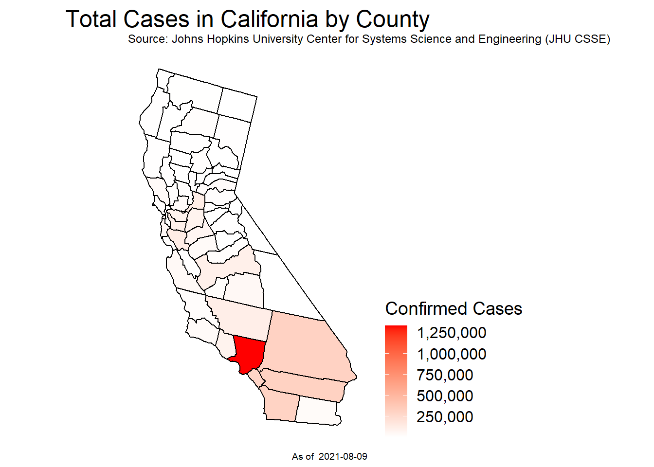
Total Confirmed Cases
prevalence <- plot_usmap(data = mapdf, values='Confirmed', include = 'CA')+
  scale_fill_continuous(low = 'white', high = 'red', name = 'Confirmed Cases', label = scales::comma)+
  labs(title = 'Total Cases in California by County',
       subtitle = 'Source: Johns Hopkins University Center for Systems Science and Engineering (JHU CSSE)',
       caption = paste('As of ', as.Date(max(mapdf$Date))))+
  theme(plot.title = element_text(hjust = 0.5, vjust = 0.25, size = 18), legend.position = "right",
        legend.title = element_text(size = 14), legend.text = element_text(size = 12))
Exploration of Covid Cases within California
Figure 1: Incidence
# Hover info of county FIPS code and covid cases within the county from the max date
ggplotly(incidence, width = 800)
Figure 2: Prevalence
# Grand total of covid cases at the start of the pandemic
# until the max date being the day before
prevalence
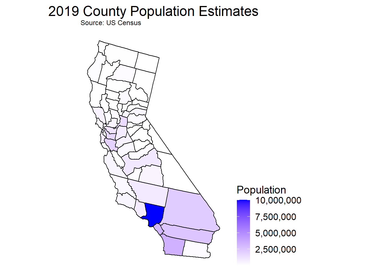
US Census data of California
CAcensus <- read_csv("data/cc-est2019-alldata-06.csv")County Populations Within California
plot_usmap(data = Popmapdf, values='TOT_POP', include = 'CA')+
  scale_fill_continuous(low = 'white', high = 'blue', name = 'Population', label = scales::comma)+
  labs(title = '2019 County Population Estimates', subtitle = 'Source: US Census')+
  theme(plot.title = element_text(hjust = 0.5, vjust = 0.25, size = 18), legend.position = "right",
        legend.title = element_text(size = 14), legend.text = element_text(size = 12))
Running Total of Confirmed Cases by Population of Counties
# Visual of how county population influences covid cases
cvd_pop%>%
  plot_ly(x = ~TOT_POP, y = ~Confirmed,
          type = 'scatter', mode = 'markers', color = ~county,
          size = ~TOT_POP, sizes = c(5, 70), marker = list(sizemode='diameter', opacity=0.5),
          hoverinfo = 'text',
          text = ~paste( paste(county, ":", sep=""), paste(" Cases per 100k: ", per100k, sep=""),
                         paste(' Population: ', TOT_POP, sep=""), sep = "<br>"),
          width = 800)%>%
  layout(title = "Covid Cases vs Population of Each County",
                  yaxis = list(title = "Cases per 100k"), xaxis = list(title = "Population"))
Enviornmental Protection Agency (EPA) Air Quality Index
# Daily AQI for every county in California
csvAQI_data <- read_csv("data/ad_viz_plotval_data.csv")
Air Quality Within California
# Averaged AQI for each county
AQI%>%
  plot_ly(x = ~COUNTY, y = ~MeanAQI, type = 'box', color = ~COUNTY, width = 750)%>%
  layout(title = 'Air Quality by California County', yaxis = list(title = 'AQI Value'),
         xaxis = list(title = 'County'), showlegend = FALSE)
New Page
Combined Visuals
# Stacked visuals of both AQI over covid cases during the pandemic

# Air Quality over course of the pandemic
line <- AQI%>%
  filter(COUNTY == 'Los Angeles')%>%
  plot_ly(x = ~Date, y = ~MeanAQI, type = 'scatter', mode = 'line',
          hoverinfo = 'text',
          text = ~paste( paste(COUNTY, ":", sep=""), paste(' Date: ', Date, sep = ''),
                         paste(' Avg AQI: ', MeanAQI, sep=""), sep = "<br>"), width = 800)%>%
  layout(title = 'Los Angeles County', yaxis = list(title = 'AQI Value'),
         xaxis = list(title = 'Date'))

# Incidences of covid cases over time
line2 <- covidGithubmelt%>%
  filter(county == 'Los Angeles')%>%
  plot_ly(x = ~Date, y = ~new_cases, type = 'scatter', mode = 'line',
          hoverinfo = 'text',
          text = ~paste( paste(county, ':', sep = ''), paste(' Date: ', Date, sep = ''),
                         paste(' New Cases: ', new_cases, sep = ''), sep='<br>'), width = 800)

time_series <- subplot(line, line2, nrows = 2, shareX = TRUE)

time_series
Attack Rate Normalized
# Incidence Rate of Covid Cases Normalized by County Population
attack_rate <- plot_usmap(data = map_merge, values='ratePer1k', include = 'CA')+
  #scale_fill_distiller(type = 'qual',palette = 'YlOrRd')+
  scale_fill_continuous(low = 'white', high = 'red', name = 'Cases Per 1K Persons')+
  labs(title = 'Attack Rate of Covid Cases',
       caption = paste('As of ', as.Date(max(mapdf$Date))))+
  theme(plot.title = element_text(hjust = 0.5, vjust = 0.25, size = 18), legend.position = "right",
        legend.title = element_text(size = 14), legend.text = element_text(size = 12))

ggplotly(attack_rate, width = 800)